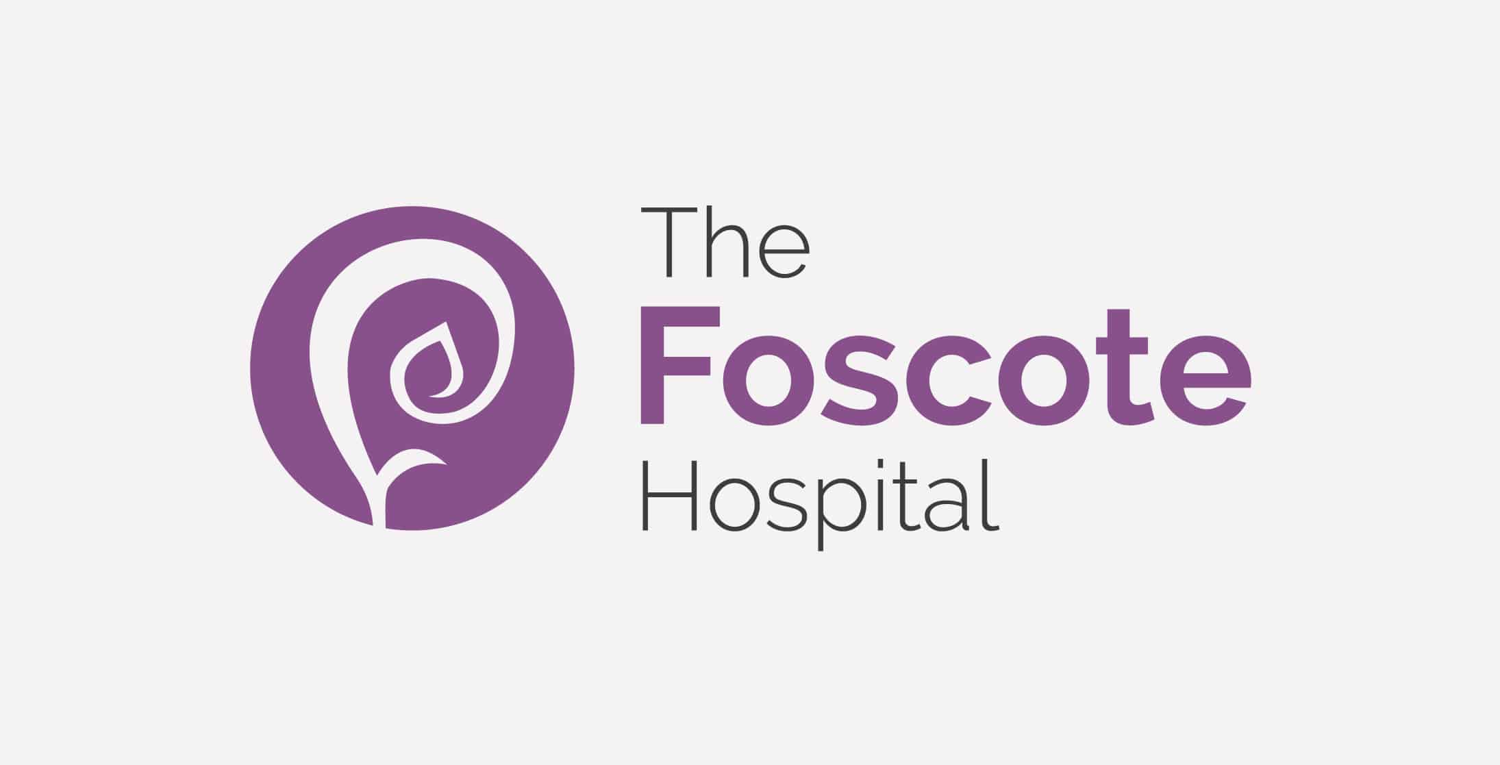
A natural, soft fern style shape was developed to symbolise growth and regeneration which included a heart at the centre to represent health. This was created to be used as a stand-alone icon for digital use and social media applications.
Challenge.
The Foscote Hospital is an independent private hospital in Banbury, providing a wide range of healthcare services and treatments to self-pay and privately insured patients. They approached Toast to redesign their existing brand and website. We relished the challenges involved in responding to their Hospital Branding requirements.
Approach.
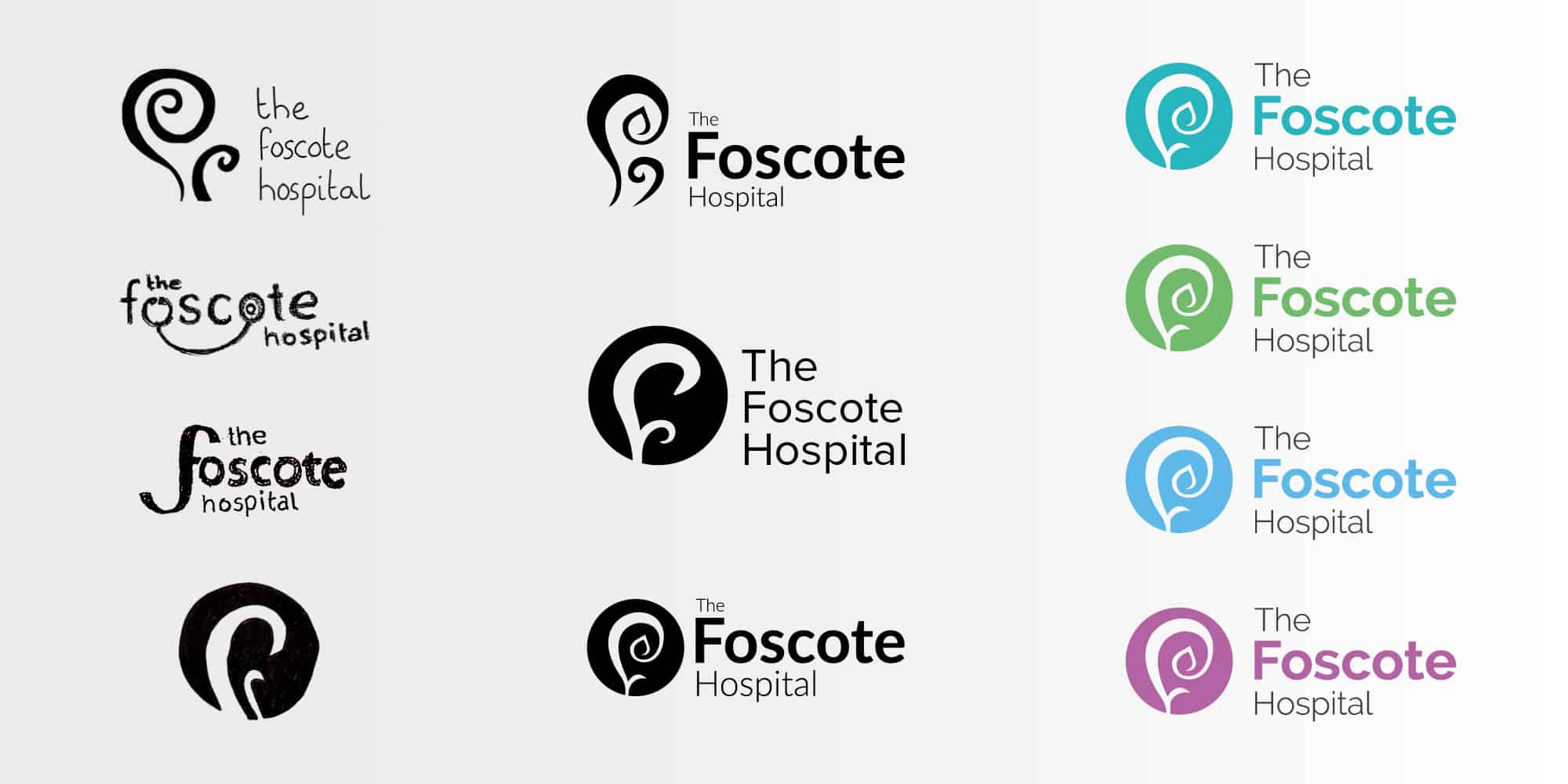
Using mood boards and sketched concepts we established a design style and direction with the client. We then developed the initial concepts to polished visuals from which the final logo was developed.
Solution.
Toast created both our new branding and website. We’ve been delighted, not only with the results, but also with the ease and transparency of the process. The team have been a pleasure to work with, providing great creativity, advice and expertise combined with patience and good humour. It’s fantastic to have such a great company on our doorstep and we recommend them very highly.
Signage.
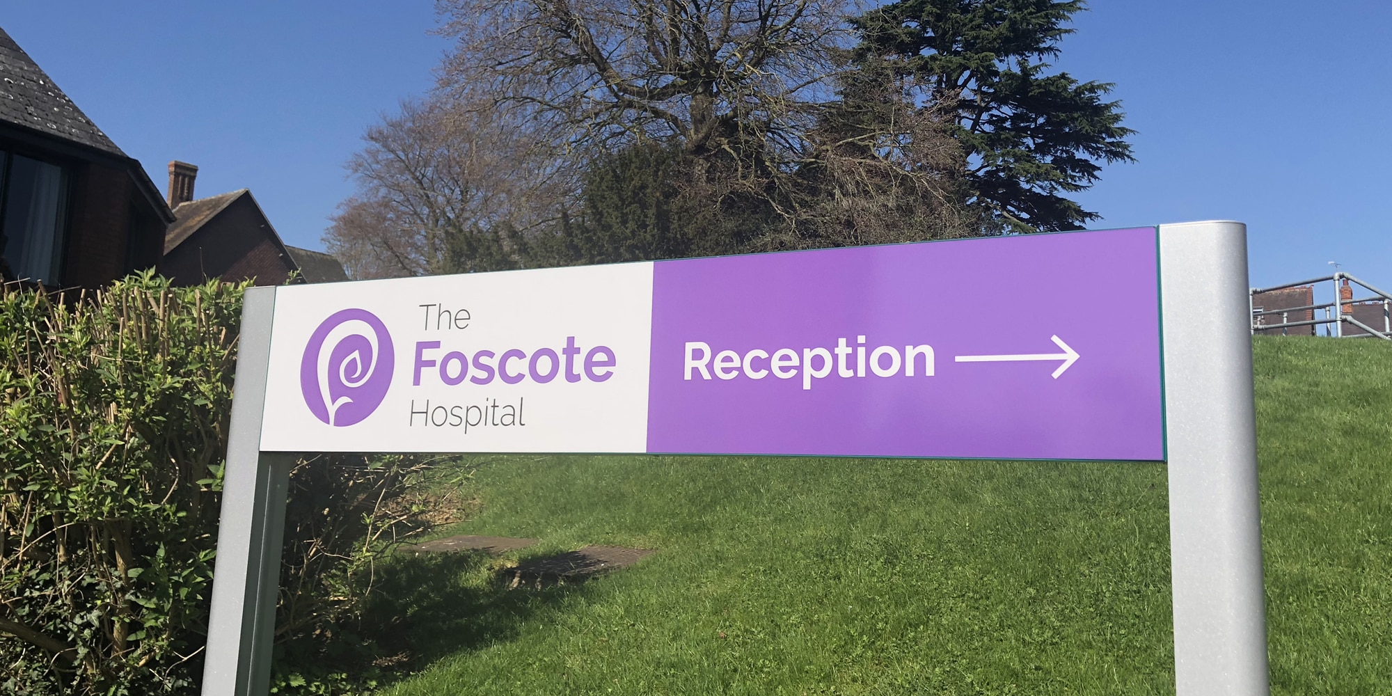
The finalised logo was applied to signage in various locations around the hospital and main entrance.
Talk to us about your signage design.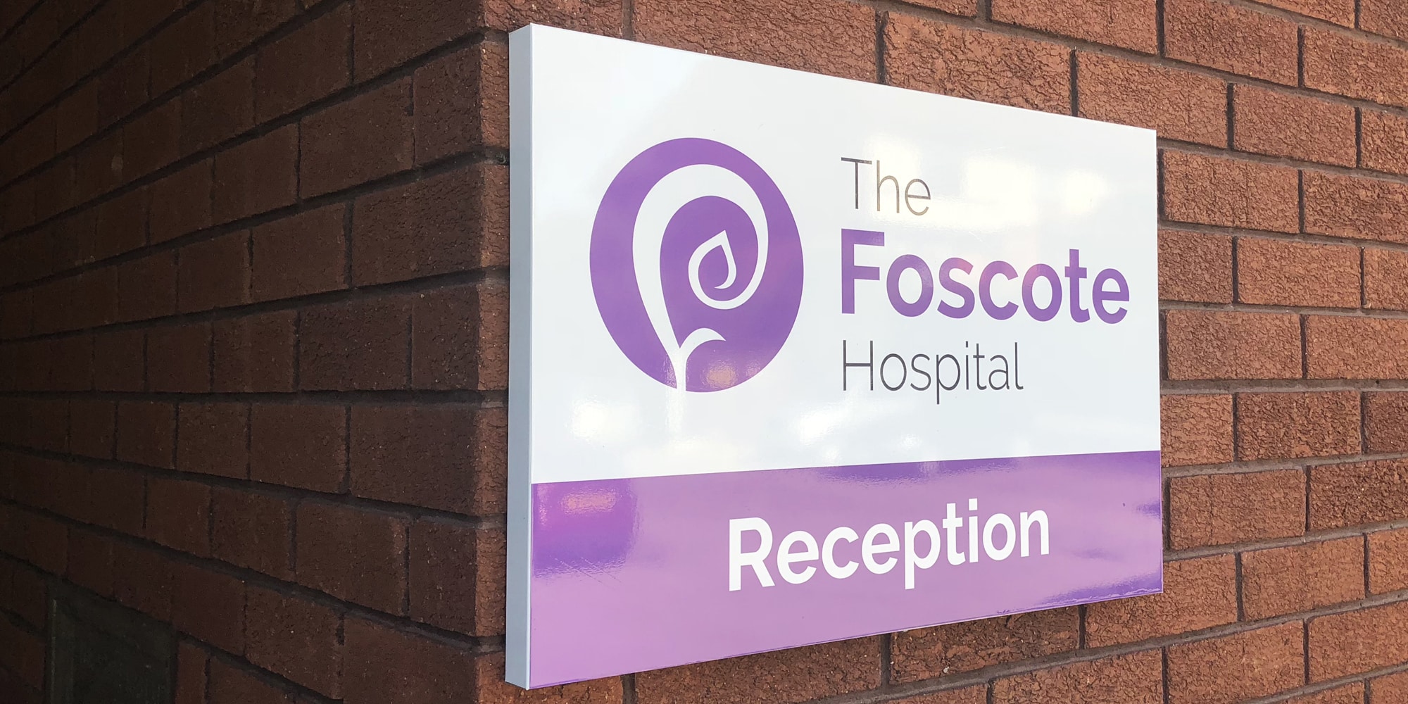
Website.
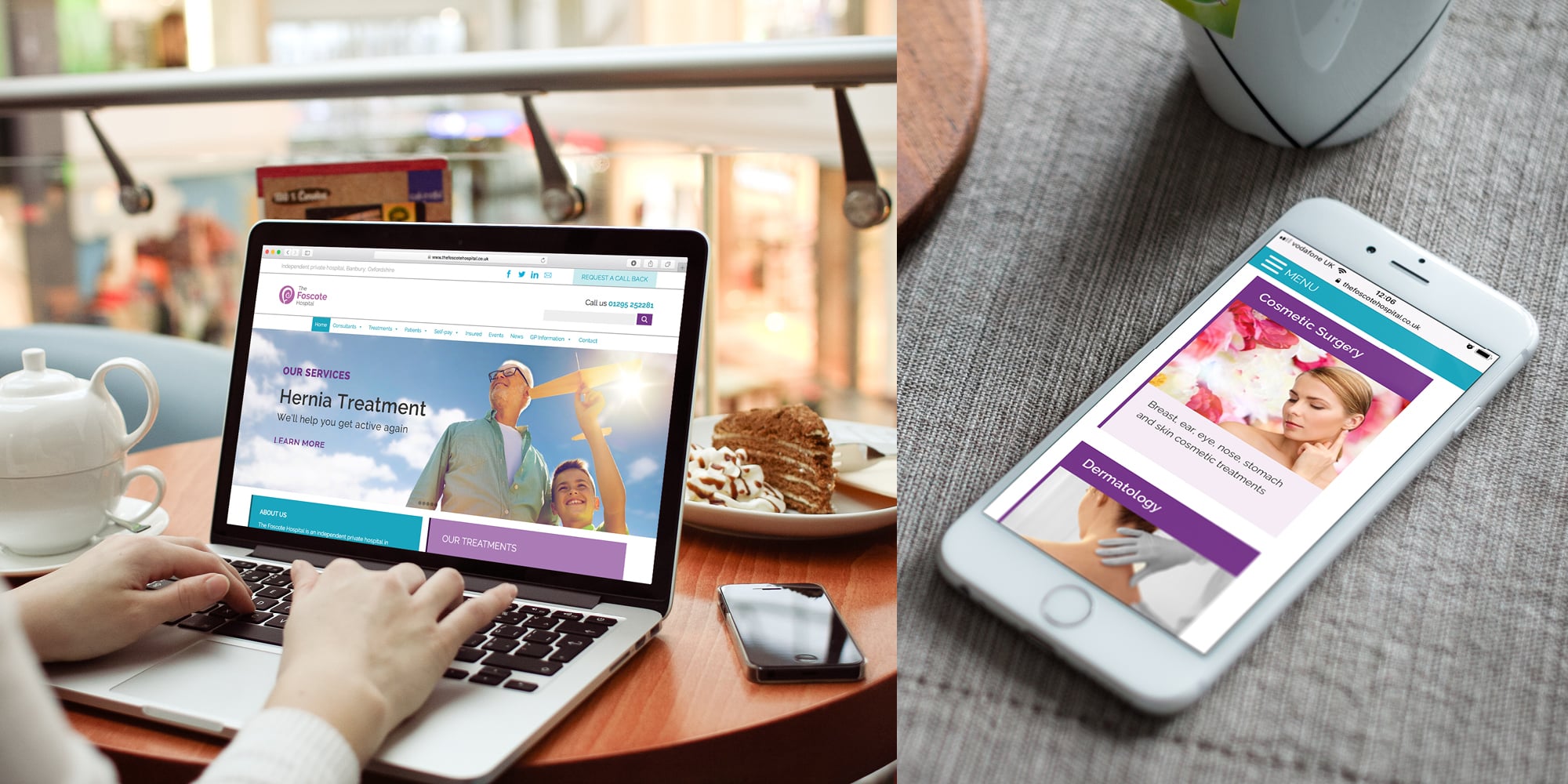
Toast then created The Foscote Hospital’s new WordPress website and applied the new hospital branding. This included:
Brochures.
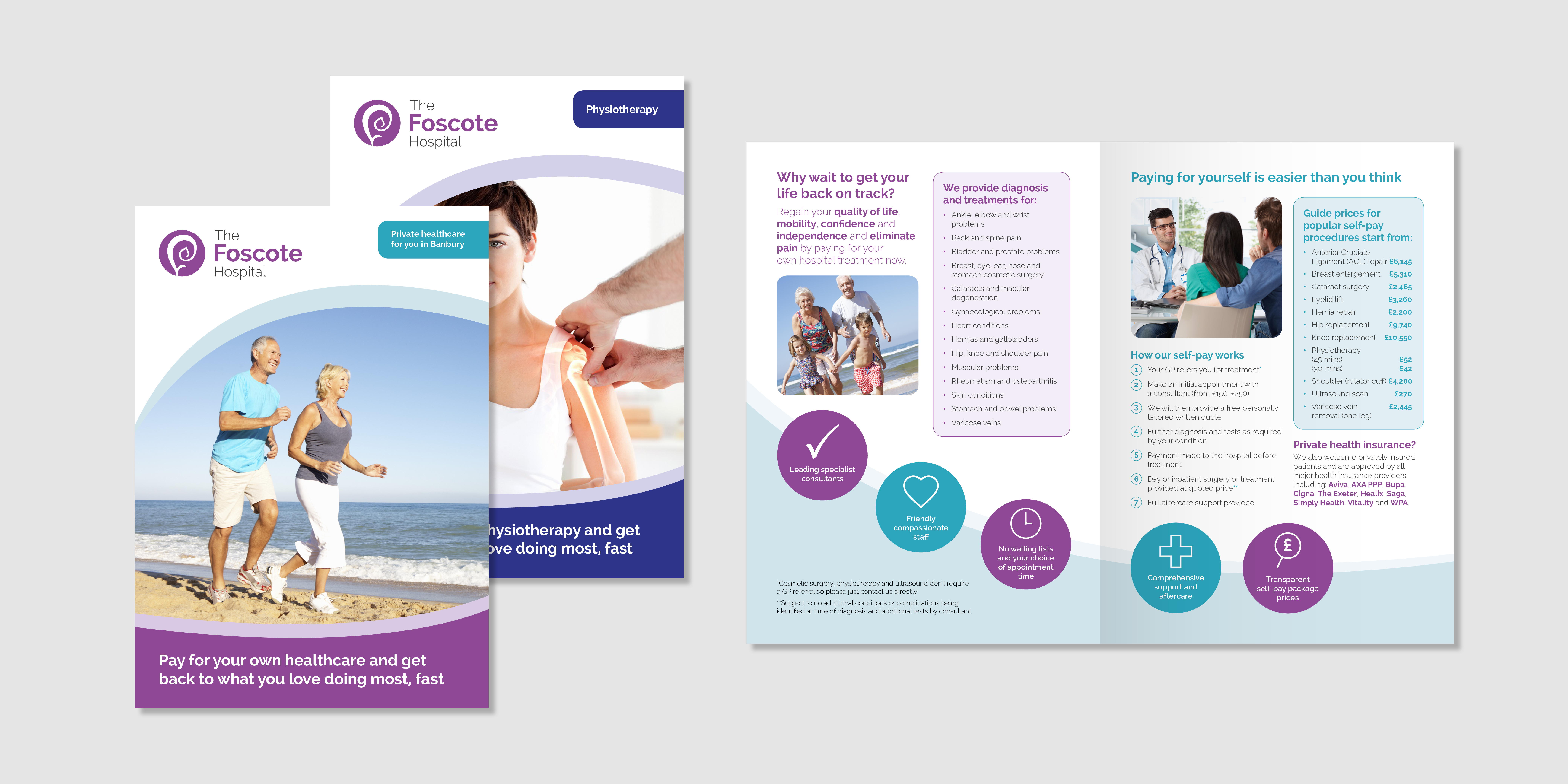
Brochures were created to promote different sectors of the hospital. Natural shapes within the logo were used as part of the design.
Talk to us about your brochure design.