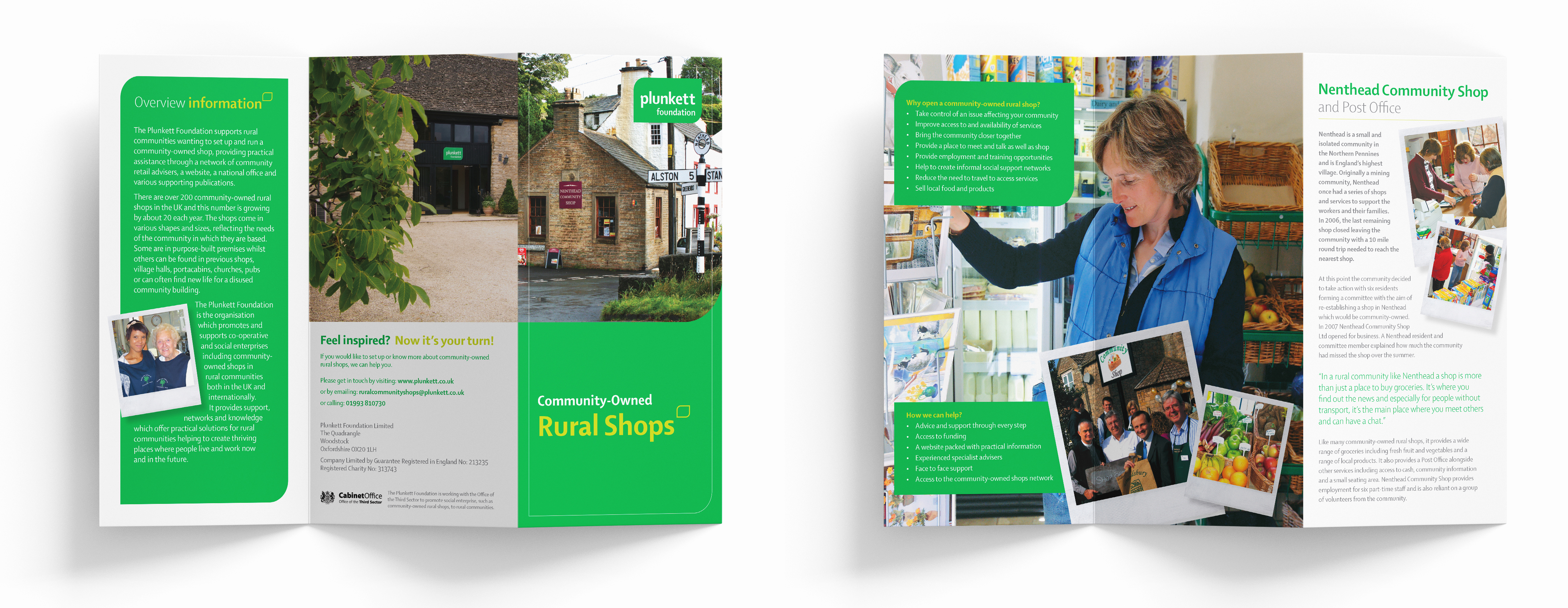
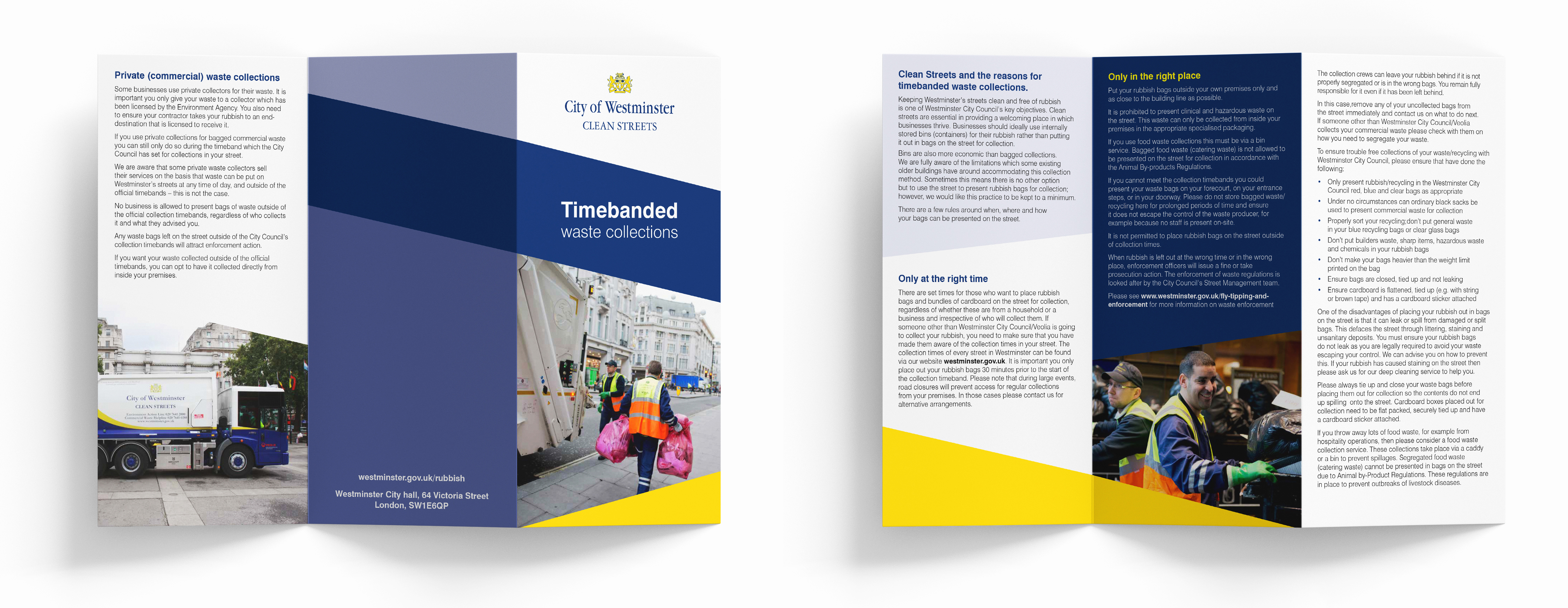
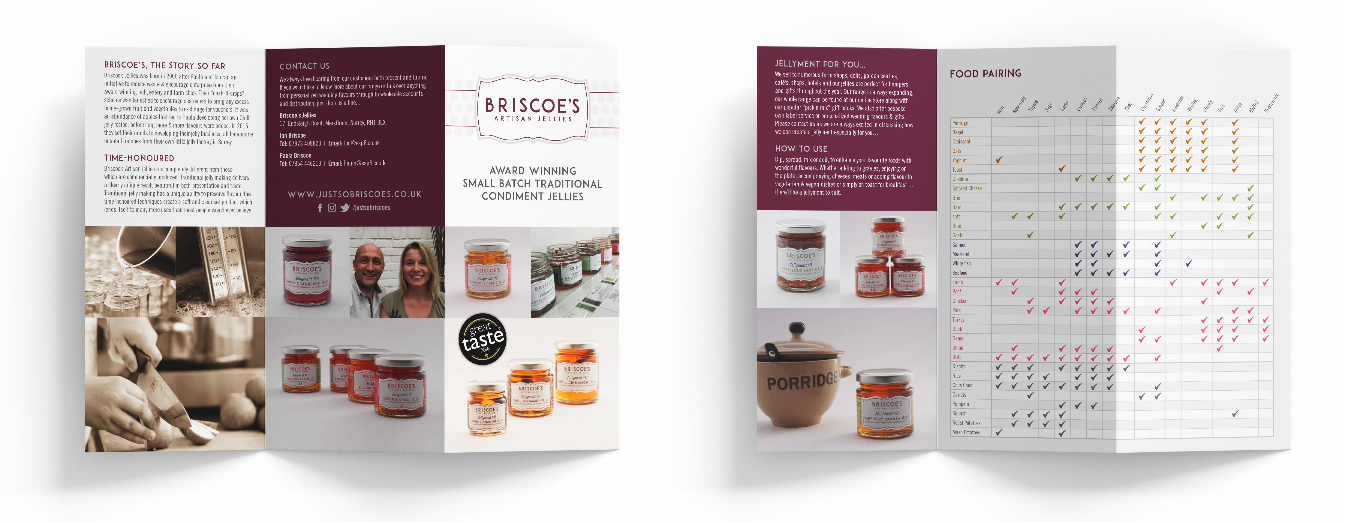
In this increasingly digital landscape, we believe there’s still a space for great leaflets that connect with new and existing customers.
Leaflets are a cost-effective way of mass marketing to your potential new customers, and there’s nothing quite like a physical piece of marketing collateral that your customers can keep, rather than just bookmark.
Effective leaflet design takes in the content as well as the design, and as this is a printed item, consideration should be given to the stock the leaflet is printed on too.
And they are still effective as 79% of people will either keep, share or read them (source).
1) Less is more
On the whole, leaflets are small. Usually a single page, A5 or smaller. This means that space is at a premium, and you’ll have to bear this in mind when deciding what information to include in your leaflet design.
Don’t be tempted to cram everything in, as it’s unlikely to be read and might land your message in the recycling bin. Identify the key message and call to action for your leaflet and prioritise them in the planning stages.
2) Incorporate traditional elements
Handmade graphics such as hand lettering and hand-drawn illustrations can help your leaflet feel more personable and original. It’s a great way to add extra detail and draw in future customers.
3) Digital extras
Just because you’re designing a printed leaflet, it doesn’t mean you can’t take advantage of some digital extras. You can add a QR code to encourage visitors to visit your website for more information, or include a discount code for anyone who goes on to purchase your goods or services online. You can also consider having your leaflet templates professionally designed in Canva so you can edit them quickly and easily should you need to print variations.

4) Add value to your leaflet
Your leaflet or flyer needs a very clear message. Ideally, it needs to be a reason for a potential customer to keep hold of it. Always keep this in mind!
5) More than words? Try adding infographics
Flyers are a great canvas for infographics as they help you get your message out there to your audience without confronting them with reams of text. Keep in mind when building your flyer that you want your infographic to be easy to read and understand when printed out and held in your hands.
6) Function first!
It might sound obvious, but it’s important to ensure that your flyer is easy to read, even if it’s just a quick glance. Keep your font sizes large and your leading generous. Pull out a website address in a bold colour, or make sure the date and time of an event are blown up to a large scale.

7) Don’t be tempted to print out your online advertisements
Digital advert designs will rarely work in a print medium. The priorities and capabilities are entirely different. If you’re going through the trouble and cost of printing leaflets, let’s make sure they work hard for you.

