Using different formats for brochures can really make them stand out.
Just because it’s a brochure, it doesn’t mean that it has to be A4. We’ve designed 100s of brochures and we’re experts in both B2B and B2C brochure design – below are a few of the non-standard brochure design projects we’ve worked on.
The postcard and sleeve brochure
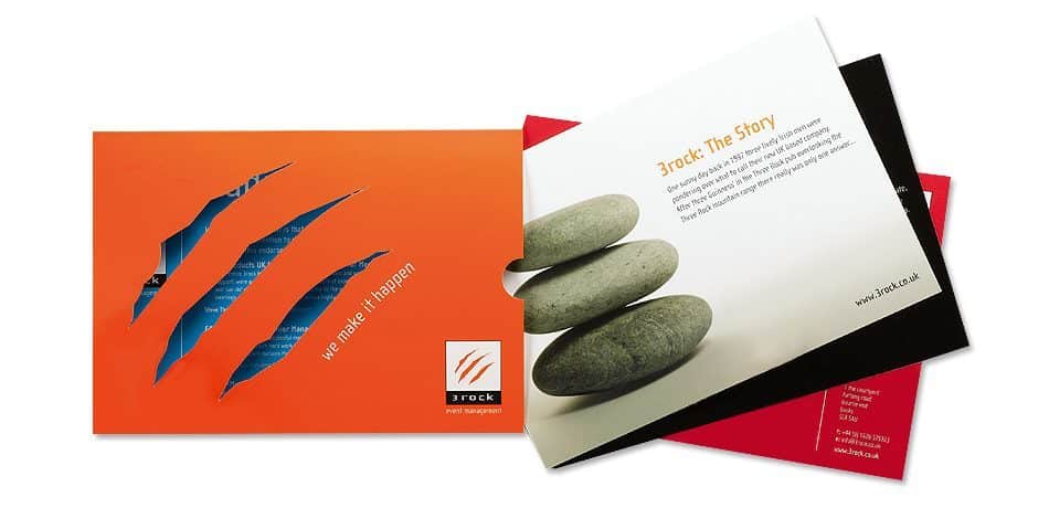
If you have content that changes on a regular basis, or if a standard brochure just won’t give you the flexibility you need, using a different format for your brochure such as a sleeve with inserts might be the way to go.

We designed this brochure some time ago, but the idea remains strong. The brochure format consists of an outer sleeve, with postcard inserts.
This format allowed our clients to customise the brochure for each and every client. Two-sided inserts are more cost-effective to produce, so we suggested a little more investment in the sleeve with the nice die cut to show a peek at the content inside – the brochure design also fitted in perfectly with the overall branding.
Creating the wow-factor
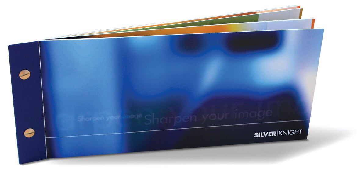
The brochure format below is completely different but follows the same principles. A flexible design, this time held together with binding screws, and a non-standard format for the paper size really make this brochure different.

Combining different formats to create a more useful brochure
If you’ve got several different things to send out in your brochure, we can get even more creative by developing formats that allow for multiple uses.
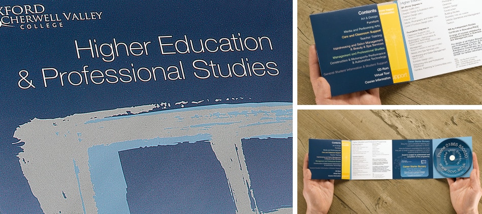
The example below uses a throw-out for the main design, but also incorporates a pocket in which additional four-page fliers can be added.
In this case, we printed a larger quantity of the outer (to make them less per item) and fewer of the inserts so our client could print these digitally and in shorter runs.

The benefits of using different formats for brochures
Ultimately, there’s no point in using a different format for your brochure just for the sake of it.
These brochures were designed as you see above to meet the requirements of the brief and to give our clients the flexibility to customise their marketing materials.
If you’re considering a new brochure and would like to discuss how you could do it differently, get in touch below – we’ve two decades experience in brochure design and have produced a wide range of materials using different formats, materials and bindings.


